Contribute to Frontend
Local Development
React Strict Mode
React Strict Mode is enabled by default, which will mount all components twice during local development.
This helps in verifying the integrity of the React components, and is in alignment with all the frontend use cases known and envisioned currently.
Responsive Design
-
Grid Layout
Use Ant Design’s Grid system to create responsive layouts. It provides a flexible system for different screen sizes.
  import { Row, Col } from 'antd';

  <Row gutter={16}>
    <Col xs={24} md={12} lg={8}>
      Content 1
    </Col>
    <Col xs={24} md={12} lg={8}>
      Content 2
    </Col>
    <Col xs={24} md={24} lg={8}>
      Content 3
    </Col>
  </Row>
This layout ensures that on small screens (xs), each item takes the full width. On medium screens (md), each item takes half the width, and on large screens (lg), they take one-third.
Responsive Visibility
Use Ant Design’s Grid and Responsive utilities to control the visibility of components at different screen sizes.
-
Media Queries:
  import { useMediaQuery } from 'react-responsive';

  const isDesktop = useMediaQuery({ query: '(min-width: 1224px)' });
  const isTablet = useMediaQuery({ query: '(max-width: 1224px)' });

  return (
    <>
      {isDesktop && <div>Show on Desktop</div>}
      {isTablet && <div>Show on Tablet</div>}
    </>
  );
Avoid Inline Styling
Instead of inline styles, prefer to use CSS classes, styled-components, or Ant Design’s built-in styling with LESS. This ensures consistency and easier maintenance.
Testing on Multiple Devices
Regularly test the application on various screen sizes and devices, ensuring that the layout is consistent. Use the developer tools in your browser for quick testing.
Separate Class/Modifier for New Features
When adding new features or plugins, avoid overriding shared styles. Instead, use specific class names to prevent regressions in existing features.
  .button {
      background-color: blue;
  }

  .button--new-feature {
      background-color: green;
      font-size: 20px;
  }
JavaScript Style Guide
Follow the Google JavaScript Style Guide for consistent code quality.
- Module exports should be at the end of the file.
- Avoid inline comments except when necessary.
- Use JSX extensions for all new React components.
File Structure
Ensure a clear, maintainable file structure
- All components should be grouped under the /src directory.
- There will be an index.js file in the /src folder containing all component exports.
- Use JSX extensions for all new React components.
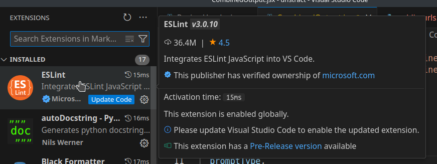
Use ESLint
Linting: Install the linter locally to catch and fix issues early.
- Extends from "react-app" and "react-app/jest".
- Includes Google's style guide with eslint-config-google.
- Prettier integration to ensure formatting consistency across the codebase.
- Run ESLint and Prettier on staged files before each commit
Supported Browsers
Ensure the code is compatible with the following browsers:
-
Production:
Coverage: Browsers with >0.2% market share, excluding obsolete browsers ("not dead") and Opera Mini.
-
Development:
Latest versions of Chrome, Firefox, and Safari.